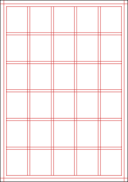
For our main grid design, this is the one that my group has chosen to go with. The first reason would be because it is easy to understand and easy to work with. The lines are all straight and can be used together with the boxes to choose where we want to put pictures and texts. The second reason why we have chosen this grid would be that it is also very versatile. There are many different ways that we can play around with it and make up different layouts. For example, the entire grid can be maybe used to just talk about one thing or, it can be very easily divided so that we can use it to talk about 3 different things. The last reason why we chose this grid would be because it is easy to manipulate this grid so as to make everything either balanced, or to draw attention to a certain portion of the grid. By dividing the grid equally, everything will look neat and balanced and by dividing the grid into 3/4 and 1/4, attention will immediately be on the 3/4 part of the page and that can be used to maybe talk about something that is more important than the information on the 1/4 part of the page.

No comments:
Post a Comment