photo banner2_zpsd42f5f4b.jpg

Wednesday, July 30, 2014

EGD Group Project: Cover page


This week in our EGD lesson, my group managed to come up with the first draft for our front cover of our newsletter. Basically we were able to put together all the parts of the cover page that we wanted. We wanted to put in the title, the month issue, the name of the mall and a picture of it. A few weeks earlier, we had all gone dowm to 313 somerset to take photos of the mall. However, after looking at all our photos and the different parts of the cover page that we wanted to have, we quickly ran into many problems.

Firstly, the original photo that we took looked like this, 


we purposely took it this way because we wanted to show both the name of the mall and the people walking in and out of it. However, we did not want the people to be so clear as it might overshadow the name of the mall which already wasn't that noticeable since it was on glass. 

When we tried to put the picture as the background, we realised that either our title or the name of the mall would end up covering the words "313 @ Somerset" in the picture. We tried to fix this problem by cropping away the words in the photo (as seen in the first draft of our layout) but the picture lost it's meaning as the because without the words, people would not be able to tell what mall it was at first glance.

Secondly, Ms Tay also brought up the fact that we should have real people in our photo instead of just the silhouettes of them as it would make it seem as though more people were visiting the mall.

Because of all these problems that we've encountered, we've decided that the best way to fix it would be to change the picture altogether. 

Tuesday, July 29, 2014

Newsletter Cover Pages


After looking at examples of many newsletters, my group has decided to do something like the pictures above. We have chosen to put our newsletter title at the top of the page, followed by a picture of 313 somerset in the background. Lastly, we will be adding in some information about what people can expect to find in our newsletter at either the side or the bottom of the page.

We have decided to do something very clean and simple for our layout because we want the main focus to be on the mall itself. We also don't want to put readers off from our newsletter by making it cluttered and crowded. But at the same time, we still want readers to be able to know what can be found in our newsletter without having to open it. Thus we have chosen something that looks very neat and organised.

Thursday, July 24, 2014

EGD Group Project: Grid Layout


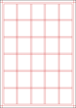
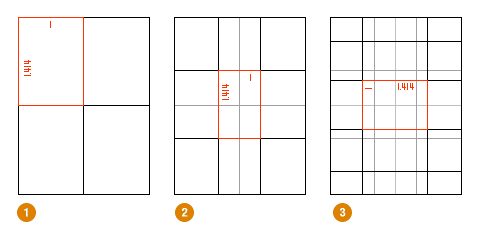
For our main grid design, this is the one that my group has chosen to go with. The first reason would be because it is easy to understand and easy to work with. The lines are all straight and can be used together with the boxes to choose where we want to put pictures and texts. The second reason why we have chosen this grid would be that it is also very versatile. There are many different ways that we can play around with it and make up different layouts. For example, the entire grid can be maybe used to just talk about one thing or, it can be very easily divided so that we can use it to talk about 3 different things. The last reason why we chose this grid would be because it is easy to manipulate this grid so as to make everything either balanced, or to draw attention to a certain portion of the grid. By dividing the grid equally, everything will look neat and balanced and by dividing the grid into 3/4 and 1/4, attention will immediately be on the 3/4 part of the page and that can be used to maybe talk about something that is more important than the information on the 1/4 part of the page.

Monday, July 21, 2014

EGD Group Project: 313


For my groups EGD project, we have decided to create a newsletter on 313 somerset. We chose 313 somerset as it contains a lot of interesting shops that we can share information on and also it actively holds many small events for companies such as VISA or World Wide Fund for Nature (WWF). With our newsletter, people would be able to keep up to date with what is happening at the mall and about the special promotions that might be going on. For the colour scheme, we plan to go with purple and white as those are the colours that are widely used in the mall. By using the same colours as those that are used in the mall, people will be able to see the relation that we have with it. As the shops there are mostly catering to the youths, they too will also be our target audience. Therefore, when writing our newsletter, we must ensure that it is not too wordy and that the information given is something that youths will be interested in reading. The layout must also be easy on the eyes and uncluttered as if not, people will not be interested in reading out newsletter.

Thursday, July 17, 2014

The Golden Ratio: Examples


Even though this is not a newsletter, I feel that from this example of how the golden ratio is used, I can still incorporate it into my project. Using this example, they show how the main 60% of the page is what they want people to first see and the remaining 40% consists of the smaller details. This ending point, where people also tend to focus the most at, would then be the SALE- FINAL REDUCTIONS sign. I can use this in my newsletter as instead of adding in too many words and cluttering up the whole page, I would fill the first 60% of the page with a picture then then the other 40% would be text giving information that relates to the picture. The ending point could then maybe be a title or a logo. 


Another example would be this. My first 60% could be a picture and some texts while the remaining 40% could be a side bar that contained less important information. By applying the golden ratio, I am not only ensuring that the layout of my newsletter is clear, I am also ensuring that all the main points of my newsletter are highlighted and that they are not overshadowed by the less important parts.

Wednesday, July 16, 2014

The Golden Ratio


Every since learning about it, the golden ratio would definitely be one thing that I would like to use in my newsletter. I find it interesting that even though it is not meant to be balanced, when used correctly, this ratio still managed to make a complete design look balanced. It also helps draw focus to key points on the page and thus making it easier for you to plan where you would want to maybe put the company's logo for example. The golden ratio also shows you where the main part of the whole design should be at and this would be where you could possible put a picture of the product that you are trying to sell or the place or event that you are talking about. This main part would be the first 60% or so of the page as that is where people tend to look at most of the time.

Thursday, July 10, 2014

XPRESS Newsletter

Today in EGD, we were told to recreate a newsletter. With this project, I was able to familarise myself more with the the text box tool and the alignment tool. I find the text box tool in InDesign extremely useful and easy to use as I can simply draw text boxes anywhere I want as long as it is in the page. This makes it easy for me as I am able to easily design the page according to how I have planned it. The text alignment tools are also very useful as they help me create the different effects that I want my text to have like for example, if I want them to be all center aligned or all to the side. I also learned about how much boxes can be used to segment different parts of the newsletter. By adding in boxes, it makes it easier for people to differentiate the different components of the newsletter. Lastly, I also learned how to import and move photos around using InDesign.

Tuesday, July 8, 2014

Grid System


Today during EDG we learned about the grid system itself and how to fold it. The grid system is used to ensure that the design and layout of a newsletter or any other piece of work is balanced and neat. Every line in the grid shows where a picture or piece of text can be placed so that it will look uniformed and in place. This is important as it will help me and my group to be able to plan where we want to put the different elements of our newsletter at. This will make creating the newsletter even easier for us as we will already know where all the different components are suppose to go. And with the help of the grid, we will also be able to make sure that everything looks nice and in place.

Sunday, July 6, 2014

InDesign


This week during our 3 hour tutorial, we learned how to use InDesign to create newsletters. I personally find this very useful as I previously was only able to make newsletters by following the templates that were given to us on Microsoft word. I learned how to use the different tools to do things such as make the words go around a photo, add in multiple columns and make the first letter of the first word in a paragraph larger than the others. This would allow it to stand out more and thus capturing attention. One thing that I really like about InDesign is that it is really easy to create text boxes. The size and shape of the text boxes can be very easily manipulated and this makes it easier to design a whole newsletter.

Saturday, July 5, 2014

EGD Assignment FINAL


This week I finally managed to hand up my assignment and this is my finished product. As mentioned in my last EGD assignment update, I used the brushes to add extra texture and dimension to the advertisement. In the original photo shoot that Demi did for her album, she was seen with ink smears and splatters all over her body and so I decided to incorporate that into my work as well. I also changed the opacity of the brush strokes so that they would not be so harsh and thus allowing them to blend into the piece more. I also learned how to download brushes off the internet and load them into photoshop and that was how I was able to achieve the paint splatter marks.

Another change that I also made was that I extended many of the lines but I made sure to use layers so that they would not overlap neither the album cover nor the picture of Demi. This helped make the advertisement seem more complete rather than two separate pages.