photo banner2_zpsd42f5f4b.jpg

Tuesday, August 5, 2014

EGD Group Project: Brotzeit


For our last page, my group has decided to do something different. The restaurant that we will be reviewing will be Brotzeit and since the the way the sign is placed at the 313 outlet, we have decided to design the last page of our newsletter so that it will be in landscape form.


This is something different from the other pages in our newsletter so it will help make the layout more interesting so it won't just be the same thing repeating itself. Again, we have decided to use a different grid layout as it adds more variation. More so since we will be spreading out the use of the two different layouts. This means that when people read our newsletter, the layout of the pages will vary because we have chosen to use different types of grids.

For the Brotzeit page in our newsletter, we will be talking about October Fest. Since it is both a restaurant and a bar and our target audience are youths and young adults, we find it appropriate as people who enjoy drinking or who want to visit the restaurant will be interested in knowing what offers they have and what they will be selling.

Monday, August 4, 2014

EGD Group Project: Loyalty Membership Card (Page 4)


This is the layout that my group has managed to come up with for our loyalty card page. As you can see, instead of using the same template as before, we have decided to change things up a bit so as to make the newsletter more interesting visual-wise. We have decided to use this template as it is both easy to work with and because it incorporates the golden ratio into it. This helps ensure that if used correctly, the layout will look neat and balanced.

The most difficult part of this page would be creating an image of the actual loyalty card. We have decided to use this opportunity to incorporate some photoshop skills into our project. We have taken ideas from other popular membership cards and from these we will be creating and designing our very own card with the help of photoshop.

Also in the template, we have put aside sections to further explain the benefits of the cards, offer special discounts and we have also included the terms and conditions to not only make it seem more realistic but also because we think that it is something that is important and that it is something that people would be interested in knowing.

The Isetan membership card is an example of a card that we have made reference to because it looks classic and elegant which is what we want to achieve since our newsletter is also aimed at young adults.


Sunday, August 3, 2014

EGD Group Project: Forever 21 (Page 2)


This is the layout that my group has come up with for the second page of our newsletter which is on Forever 21. This page was designed according to the grid that my group has previously chosen. My group has decided to alternate the texts and the pictures that we will be using so that the page will be balanced. This ensures that neither sides of the page will be just full of texts or pictures. This also helps make the page look less clutters and boring. We have also decided to add in a funfact section to our newsletter as we think that readers will enjoy it instead of just reading rows and rows of information. The pictures chosen also represent the different major sections of the store such as the accessories and swimwear section. This will help to inform people about what they can expect to find in this particular outlet.

Friday, August 1, 2014

EGD Group Project: Content

During our EGD lesson this week, my group managed to finalise the content of our newsletter. 

Page 1: Cover Page
Page 2: Forever 21
Page 3: Le-Way and Limited Ed
Page 4: Loyalty Card
Page 5: Event
Page 6: Event
Page 7: Marche review
Page 8: Brotzeit review 

 When we first started planning our newsletter, we initially planned to just do it on the stores and just include information about it. However, Ms Tay reminded us that it was suppose to be a newsletter and not a catalog. Therefore, we have decided to change it to only 2 pages about the stores. Following that, we have decided to create a 313 loyalty card and promote it in our newsletter so that readers will be aware of it. The next two pages will then be about the events that are constantly held at 313 somerset. On the first floor of the mall, there is a small space where companies can rent and use to promote their causes or products. It's these kinds of events that we will be writing on as the events change with the months. Another 2 pages will be dedicated to restaurant reviews. My group believes that this is something that people who want to visit the mall will be interested in reading as they would want to know where the best places to eat are at. 

The three stores that we have chosen to cover have also been very carefully thought out. We have chosen Forever 21 as the Forever 21 outlet in 313 is the biggest one in Singapore as it has a total of 4 levels. Le-Way and Limited Ed were also chosen as they are not very common stores that can be found in Singapore. The Le-Way outlet in 313 is also the only outlet in Singapore. These stores have also been picked because Forever 21 will appeal to the females while Le-Way and Limited Ed will appeal to the males.

Wednesday, July 30, 2014

EGD Group Project: Cover page


This week in our EGD lesson, my group managed to come up with the first draft for our front cover of our newsletter. Basically we were able to put together all the parts of the cover page that we wanted. We wanted to put in the title, the month issue, the name of the mall and a picture of it. A few weeks earlier, we had all gone dowm to 313 somerset to take photos of the mall. However, after looking at all our photos and the different parts of the cover page that we wanted to have, we quickly ran into many problems.

Firstly, the original photo that we took looked like this, 


we purposely took it this way because we wanted to show both the name of the mall and the people walking in and out of it. However, we did not want the people to be so clear as it might overshadow the name of the mall which already wasn't that noticeable since it was on glass. 

When we tried to put the picture as the background, we realised that either our title or the name of the mall would end up covering the words "313 @ Somerset" in the picture. We tried to fix this problem by cropping away the words in the photo (as seen in the first draft of our layout) but the picture lost it's meaning as the because without the words, people would not be able to tell what mall it was at first glance.

Secondly, Ms Tay also brought up the fact that we should have real people in our photo instead of just the silhouettes of them as it would make it seem as though more people were visiting the mall.

Because of all these problems that we've encountered, we've decided that the best way to fix it would be to change the picture altogether. 

Tuesday, July 29, 2014

Newsletter Cover Pages


After looking at examples of many newsletters, my group has decided to do something like the pictures above. We have chosen to put our newsletter title at the top of the page, followed by a picture of 313 somerset in the background. Lastly, we will be adding in some information about what people can expect to find in our newsletter at either the side or the bottom of the page.

We have decided to do something very clean and simple for our layout because we want the main focus to be on the mall itself. We also don't want to put readers off from our newsletter by making it cluttered and crowded. But at the same time, we still want readers to be able to know what can be found in our newsletter without having to open it. Thus we have chosen something that looks very neat and organised.

Thursday, July 24, 2014

EGD Group Project: Grid Layout


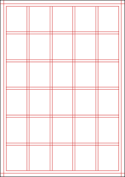
For our main grid design, this is the one that my group has chosen to go with. The first reason would be because it is easy to understand and easy to work with. The lines are all straight and can be used together with the boxes to choose where we want to put pictures and texts. The second reason why we have chosen this grid would be that it is also very versatile. There are many different ways that we can play around with it and make up different layouts. For example, the entire grid can be maybe used to just talk about one thing or, it can be very easily divided so that we can use it to talk about 3 different things. The last reason why we chose this grid would be because it is easy to manipulate this grid so as to make everything either balanced, or to draw attention to a certain portion of the grid. By dividing the grid equally, everything will look neat and balanced and by dividing the grid into 3/4 and 1/4, attention will immediately be on the 3/4 part of the page and that can be used to maybe talk about something that is more important than the information on the 1/4 part of the page.